Research, UX, Interaction and Visual Design. 2016-17
Intro to Flight Plans
Flight Plans have nothing to do with booking a flight! It is a drip campaign feature by Cirrus Insight that lives in a user’s inbox. It allows the sales people to increase their productivity by automatically triggering personalized emails, calendar reminders, calls and tasks (to-do’s) to nurture their clients.

User Research
We started by asking our own sales-people and managers about their needs by conducting surveys and quick interviews. And this is a list of needs and goals we came up with.

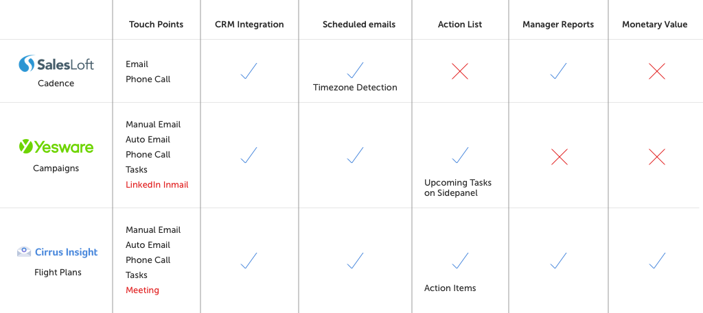
Competitor Analysis
We had competitors in this field such as Salesloft, which offered a stand-alone app. Cirrus Insight’s biggest competitor, Yesware, also released a similar feature right after our launch, so we constantly reviewed, compared and improved our feature.
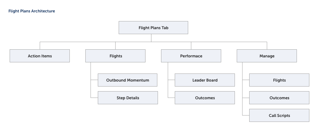
Architecture
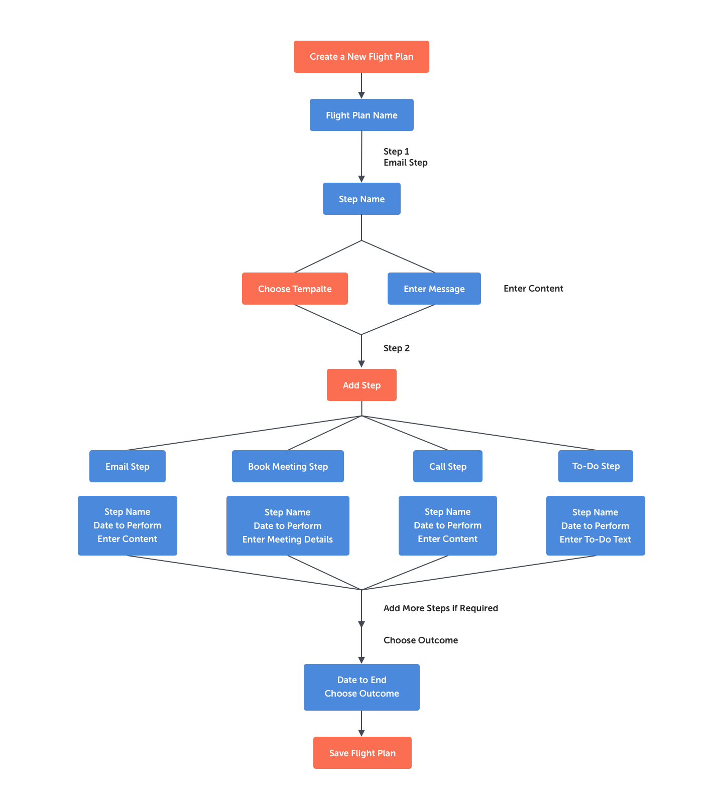
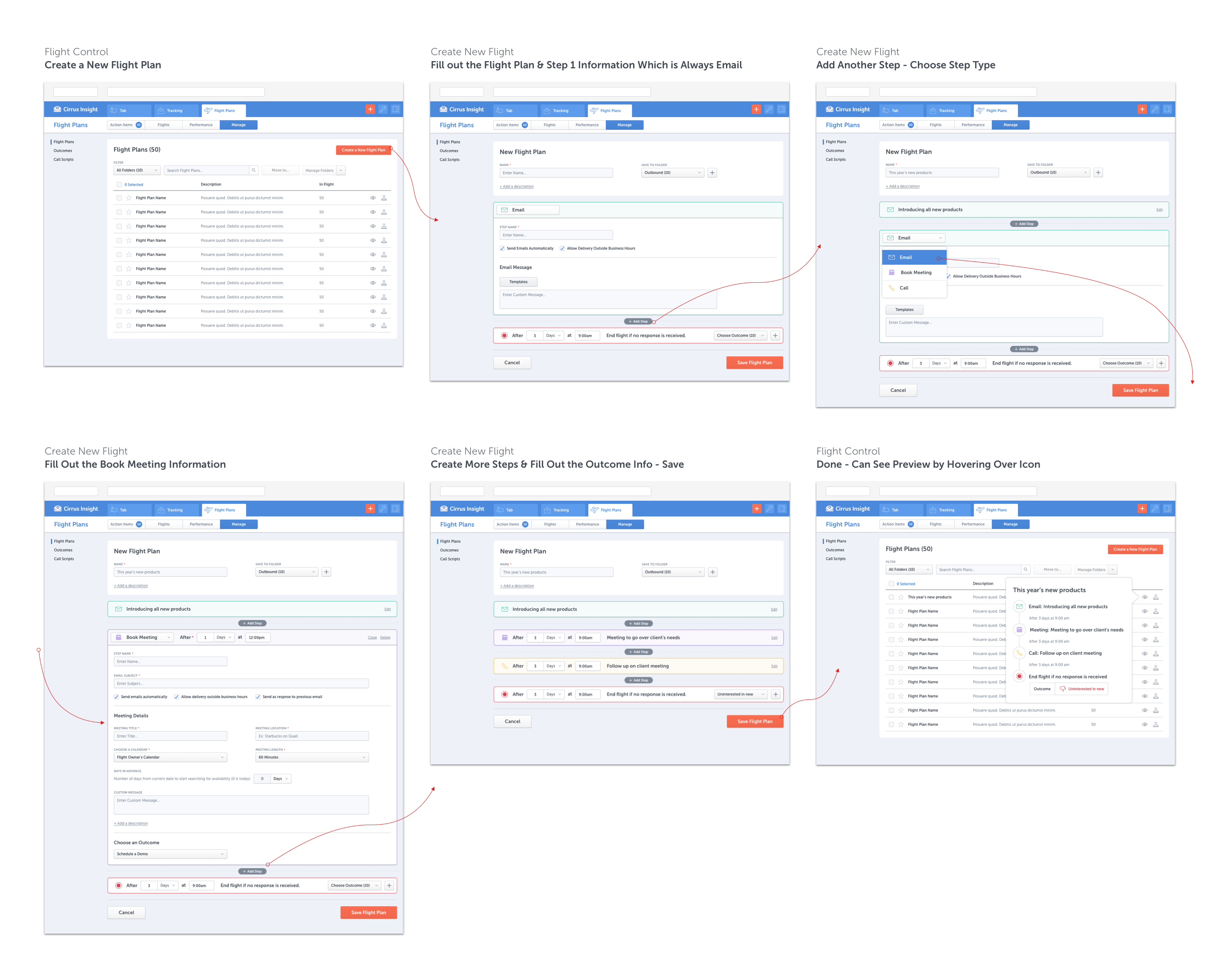
Create a Flight Plan Flow Chart
To begin with this complex feature, the engineers started to build the engine for the admin creating a new flight plan template. I started my designs while thinking about the architecture of the feature as a whole.
Create a Flight Plan Wireframes
The admin creates the flight plans and makes it available to other users. They add a timeline of email, phone call, meetings, and To-Do’s. They also sign a monetary outcome to each flight plan to easily measure the success of campaign.

Create a Flight Plan by Manager
After many revisions this is the final version of creating a new flight plan. An important addition to this flow is choosing an Outcome in case the campaign was not successful.
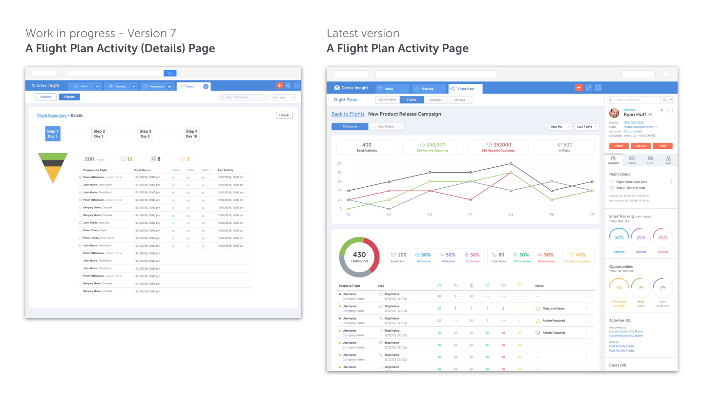
Flight Plans Page
This page contains a complete list of all flight plans and all the details of how many receivers are in each one, what steps have been taken and what outcomes have been received. User can also click on each flight plan to see details and stats of each flight.

Flight Plan Detail Page
On previous post, when user clicks on one flight plan they will open the flight plan activity page. Designing Flight Plans was an iterative process. Here I show two versions in the design process. At the beginning we were obsessed with using a diagram that resonates a sales funnel. But after testing version 7 we learned our users do not understand the diagram or the iconography. So we moved on to different diagrams and graphics that were more understandable. We also broke this page into two: Outbound momentum and Step details as we didn’t want to cramp too much info in one page.
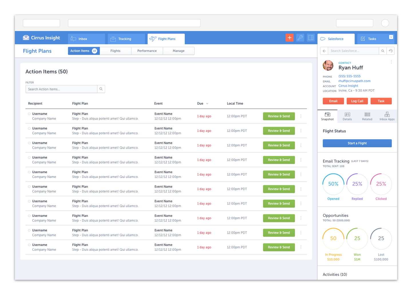
Action Items
We knew we wanted to have an actionable list for our users based upon user feedback. Every morning they could take a quick look at what has happened with their campaigns and what actions they need to take.
Start a Flight Plan
Users have different ways of starting a new Flight Plan. One of the most common options is through their inbox compose panel.

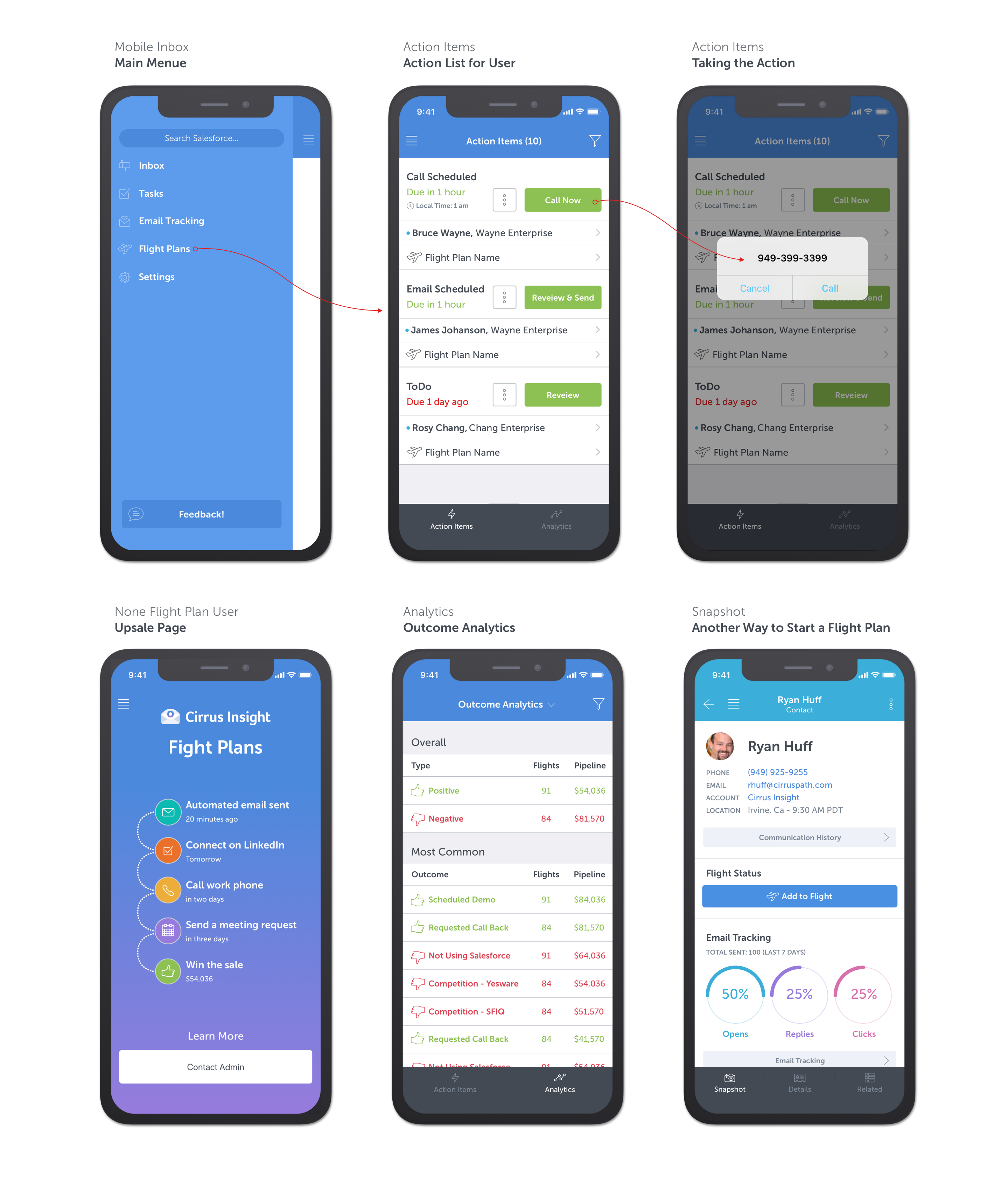
Flight Plans Mobile
We kept Flight Plans on the Cirrus Insight mobile app simple. For example, I first started with creating a flight plan on mobile, but soon after talking to our sales managers we realized they most probably would only do it on their desktop. So we developed the pages useful and necessary to mobile users.