When I started at Cirruspath in 2015 we already had a great product. Cirrus Insight, a sales and marketing productivity application and integration of Salesforce for different inboxes. From a designer perspective I knew the app needed a user experience and user interface redesign. Here is why:
Scalable Design: The current design was not scalable. We knew we will be adding a lot of new features in near future.
Better Architecture: Everything on the side panel were grouped together. There was no architecture on utilitarian elements, features etc.
Ease of use: Based on user feedback we knew some of our main features are not easy to find or use. Such as Add to Salesforce in inbox.
Consistent Experience: The experience on desktop and mobile was not consistent.
Current and Professional Look: The interface needed a complete make over to look current and awesome as the app itself!
In this journey I redesigned the inbox compose features on desktop and mobile in two different phases you will see below, so buckle up!
RESEARCH
Existing Cirrus Insight App
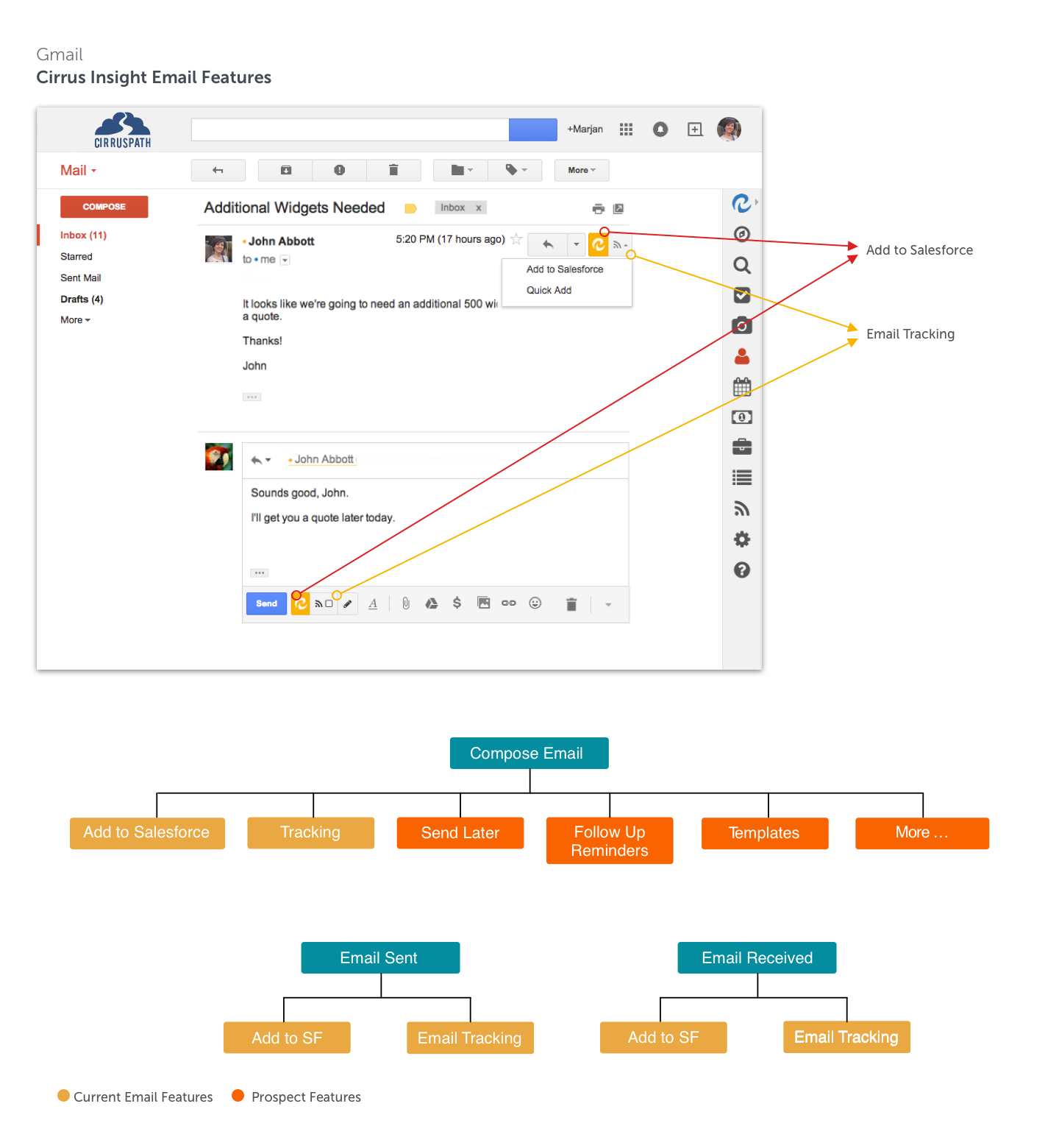
Cirrus Insight is a productivity application and integration of Salesforce in different inboxes.
Inbox features such as Add to Sleasforce and Email Tracking lived in users email pane.
Side panel included all the Salesforce integrations and it interacted with the email pane. For example if user hovered on a name in inbox, they could see all their Salesforce information on the side panel. Without needing to witch to Saleforce external software.
Regrouping Side Panel Elements
In side panel all the features were clumped together. I needed to regroup them to make a better architect that was both intuitive for users and scalable.
Excising Email Features
We started looking at our important features on inbox such as Add to Salesforce and Email Tracking and trying to figure out how we could come up with a better design that was scalable and could be applied to the new features.
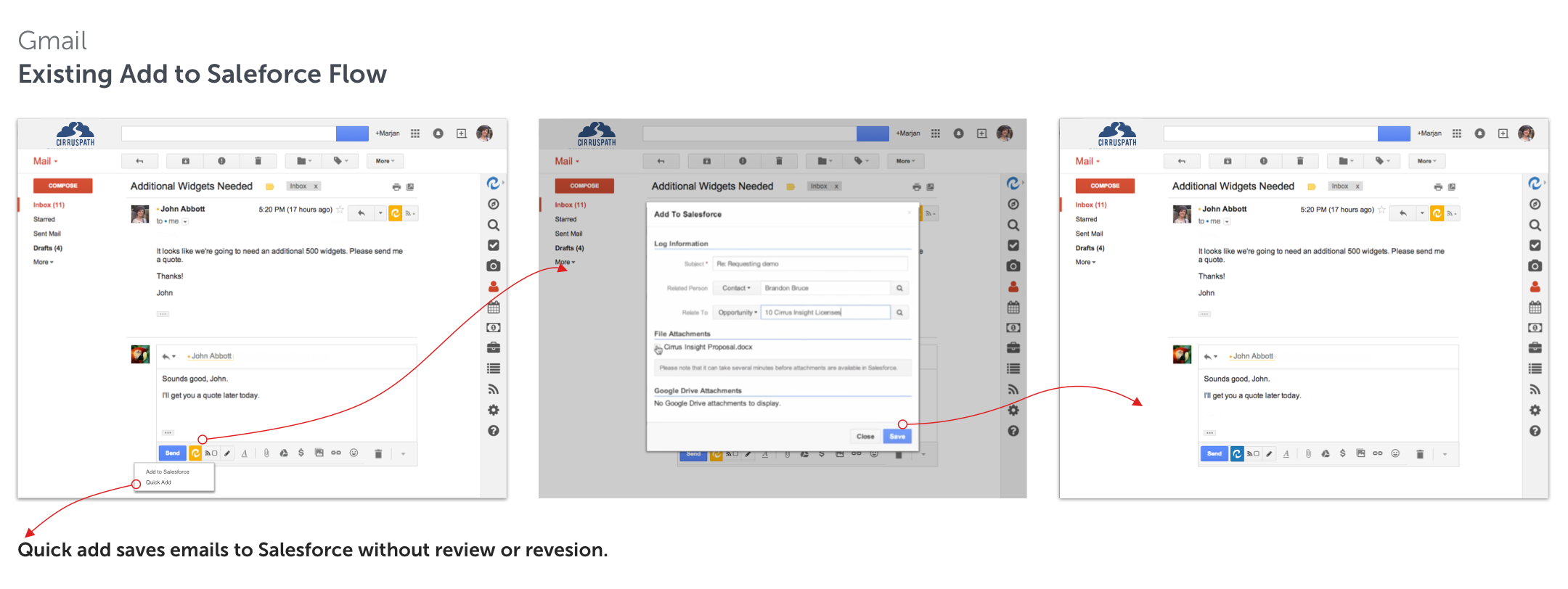
Excising Add to Salesforce Flow
Testing Add to Salesforce Flow
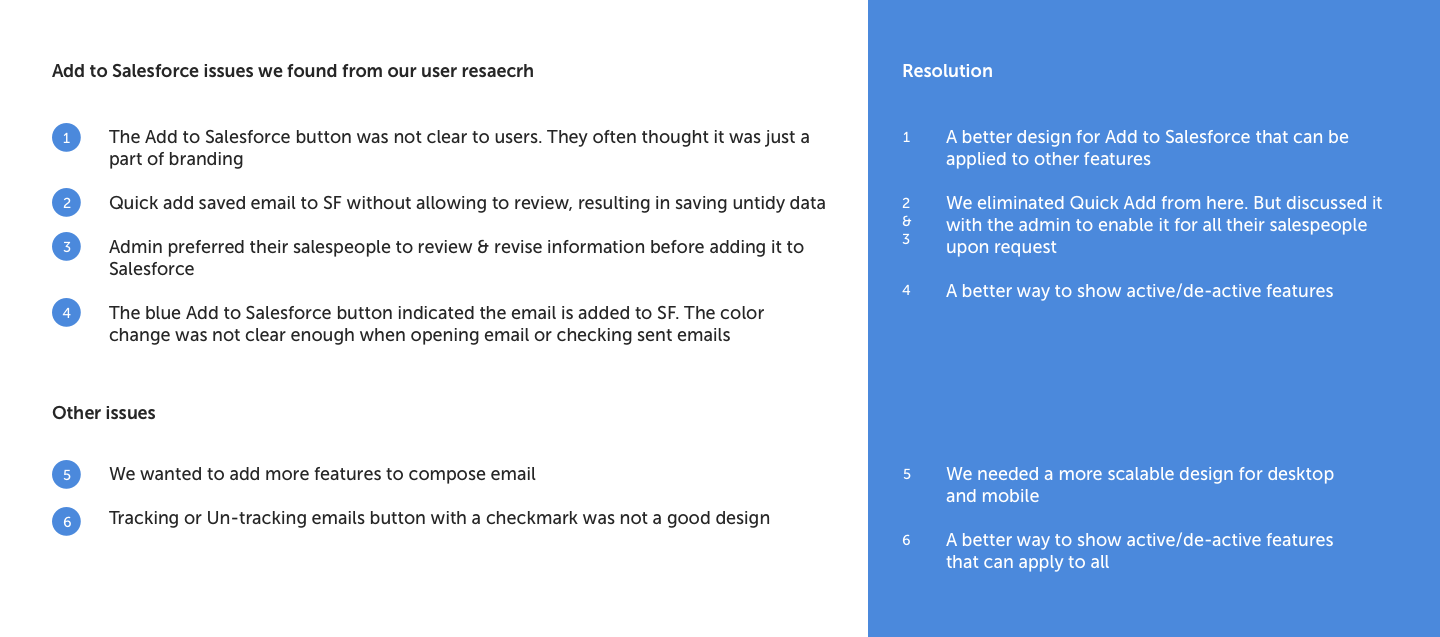
We tested Add to Salesforce with a group of our new users. I also sat down with our support team in video calls and observed how the new users worked with the app. Here are some of our findings:
Excising Add to Salesforce Flow in Mobile
We decided to start our design from our mobile app. As we knew it will be a greater challenge which desktop could follow.
PROTOTYPE
Wireframes
Add to Salesforce and Compose Email Redesign
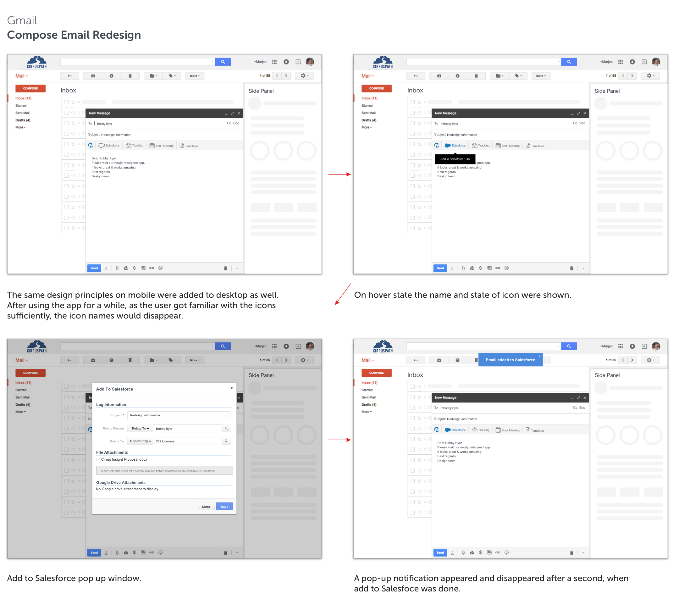
Compose Redesign Desktop
CIRRUS INSIGHT 5.0
Cirrus Insight 5.0 Complete Redesign
In October 2016 we released Cirrus Insight 5.0. A completed redesigned and rebranded application on desktop and mobile.
Watch it Work on Mobile
Cirrus Insight 5.0 Desktop Redesign
With this redesign user can easily find all the controls available at compose pane. Branding and side panel redesign was done by my colleague Keith Barney.